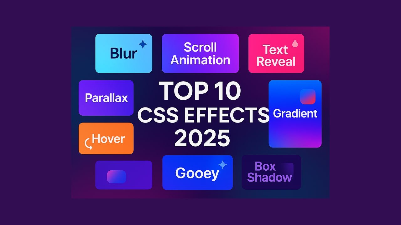
CSS has evolved far beyond basic styling. In 2025, developers and designers are taking advantage of advanced visual effects to create immersive, interactive, and visually stunning websites. In this article, we’ll explore the top 10 CSS visual effects that are trending in 2025 and how to implement them effectively.
Table of Contents
- CSS Scroll-Linked Animations
- Glassmorphism 2.0
- Animated Gradient Backgrounds
- Text Reveal Effects with Clip-Path
- CSS Blob Animations
- Magnetic Hover Buttons
- CSS Marquee Animations (Modern Approach)
- CSS Gooey Effects
- Scroll Snap Sliders
- CSS Parallax Hover Cards
1. CSS Scroll-Linked Animations
✨ What it is:
Scroll-linked animations use the scroll-timeline property to create effects that respond to the user’s scroll behavior.
🔍 SEO Tip:
Target keywords like CSS scroll animation, scroll-timeline CSS, and scroll effects 2025.
Example:
@scroll-timeline fade { scroll-offsets: auto; }
.box {
  animation: fadeIn linear;
  animation-timeline: fade;
}
2. Glassmorphism 2.0
✨ What it is:
A more mature version of the frosted-glass effect, using layered blurs and subtle transparency.
Example:
.glass {
  background: rgba(255, 255, 255, 0.2);
  backdrop-filter: blur(20px);
  border: 1px solid rgba(255, 255, 255, 0.3);
}
3. Animated Gradient Backgrounds
✨ What it is:
Smooth, looped animations using CSS gradients for vibrant and dynamic backgrounds.
Example:
@keyframes gradientMove {
  0% { background-position: 0% 50%; }
  100% { background-position: 100% 50%; }
}

.animated-bg {
  background: linear-gradient(-45deg, #ff9a9e, #fad0c4, #fad0c4, #fbc2eb);
  background-size: 400% 400%;
  animation: gradientMove 10s ease infinite;
}
4. Text Reveal Effects with Clip-Path
✨ What it is:
Uses clip-path and animations to create text reveal effects on hover or scroll.
Example:
.reveal-text {
  clip-path: inset(0 0 100% 0);
  animation: reveal 2s ease forwards;
}

@keyframes reveal {
  to { clip-path: inset(0 0 0 0); }
}
5. CSS Blob Animations
✨ What it is:
Organic, morphing shapes created with keyframes and border-radius.
Example:
.blob {
  width: 200px;
  height: 200px;
  background: #ff6f91;
  border-radius: 50%;
  animation: morph 8s infinite ease-in-out;
}

@keyframes morph {
  0%, 100% { border-radius: 40% 60% 60% 40% / 60% 40% 60% 40%; }
  50% { border-radius: 60% 40% 40% 60% / 40% 60% 40% 60%; }
}
6. Magnetic Hover Buttons
✨ What it is:
Buttons that subtly follow the cursor using CSS transforms and pseudo-3D effects.
Tip:
Use :hover, transform, and transition properties.
7. CSS Marquee Animations (Modern Approach)
✨ What it is:
A modern, smooth-scrolling version of the old <marquee> tag using keyframes.
Example:
.marquee {
  overflow: hidden;
  white-space: nowrap;
  animation: scroll 10s linear infinite;
}

@keyframes scroll {
  0% { transform: translateX(100%); }
  100% { transform: translateX(-100%); }
}
8. CSS Gooey Effects
✨ What it is:
Combines SVG filters with CSS to create a sticky, gooey effect.
Example:
filter: url(#goo);Use an SVG filter like:
<svg>
  <filter id="goo">
    <feGaussianBlur in="SourceGraphic" stdDeviation="10" result="blur" />
    <feColorMatrix in="blur" mode="matrix"
      values="1 0 0 0 0  0 1 0 0 0  0 0 1 0 0  0 0 0 20 -10" result="goo" />
    <feComposite in="SourceGraphic" in2="goo" operator="atop"/>
  </filter>
</svg>
9. Scroll Snap Sliders
✨ What it is:
Snaps sections into place when scrolling horizontally or vertically.
Example:
.snap-container {
  scroll-snap-type: x mandatory;
  overflow-x: scroll;
  display: flex;
}
.snap-item {
  scroll-snap-align: start;
  flex: 0 0 100%;
}
10. CSS Parallax Hover Cards
✨ What it is:
Cards that move subtly in 3D when the user hovers.
Tip:
Combine transform: rotate() and perspective with hover.