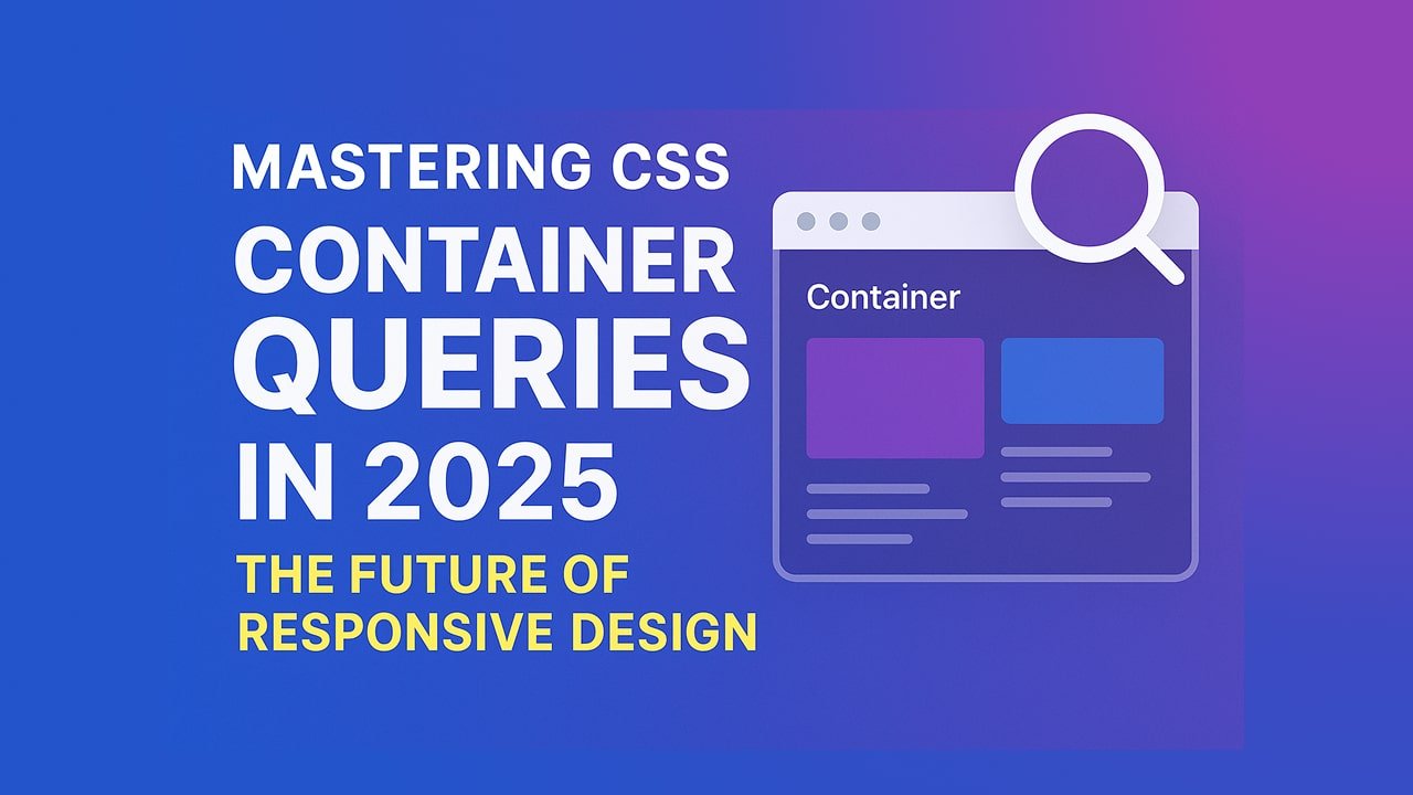
CSS Container Queries have revolutionized the way developers build responsive components. Unlike media queries, which adapt styles based on the viewport size, container queries respond to the size of the parent container — making your components more modular and adaptable.
In this in-depth guide, you’ll learn what container queries are, why they’re important in 2025, how to use them effectively, and see real-world code examples.
Table of Contents
- What Are CSS Container Queries?
- Why Use Container Queries in 2025?
- Basic Syntax of Container Queries
- Container Query Units Explained
- Real-World Example
- Best Practices for Container Queries
- Browser Support in 2025
- SEO Benefits of Container-Based Design
- Common Mistakes to Avoid
- Final Thoughts
1. What Are CSS Container Queries?
Container Queries allow CSS to apply styles based on the size of a containing element, not the entire viewport. This enables truly component-based responsive design, ideal for design systems and modular architecture.
🌟 Key Difference from Media Queries:
- Media Query: Based on
viewportwidth - Container Query: Based on
containerwidth/height
2. Why Use Container Queries in 2025?
- Modular Design: Create self-contained components.
- Reusable Components: Style blocks respond intelligently inside various layouts.
- Improved Maintainability: No need for global breakpoints.
- Performance: Fewer layout shifts due to smart, local styling.
3. Basic Syntax of Container Queries
To use container queries, define a container context, then apply styles inside a @container block.
/* Step 1: Mark an element as a container */
.card-container {
  container-type: inline-size; /* or size */
  container-name: card;
}

/* Step 2: Use @container to style based on container size */
@container card (min-width: 400px) {
  .card {
    flex-direction: row;
  }
}
4. Container Query Units Explained
Container queries introduce new units:
cqw,cqh,cqi,cqb— container width/height percentages- Example:
font-size: 5cqw;means 5% of container width
5. Real-World Example
Responsive Card Component
.card-container {
  container-type: inline-size;
}

.card {
  display: flex;
  flex-direction: column;
  padding: 1rem;
}

@container (min-width: 600px) {
  .card {
    flex-direction: row;
    gap: 2rem;
  }
}
6. Best Practices for Container Queries
- Always define
container-type - Use unique
container-namefor scoped queries - Keep components isolated for true reusability
- Use container units (
cqw,cqh) for fluid scaling
7. Browser Support in 2025
As of 2025, all major browsers support container queries:
- Chrome
- Firefox
- Safari
- Edge
Fallbacks are rarely necessary.
8. SEO Benefits of Container-Based Design
- Faster Load Times = Better Core Web Vitals
- Improved UX = Lower Bounce Rate
- More Modular Code = Less CSS bloat
- Responsive Components = Better Mobile Indexing
9. Common Mistakes to Avoid
- Forgetting
container-type - Applying queries outside the container scope
- Overlapping container and media queries without testing
- Assuming global behavior (container queries are local!)
10. Final Thoughts
Container queries are no longer experimental — they are essential in 2025 for building robust, scalable, and SEO-optimized websites. Start using them now to future-proof your front-end development.