if you want the background to smoothly change from one color to another — blending them together — you can use a CSS Gradient.
A CSS gradient is a background effect where two or more colors blend into each other smoothly. Unlike image-based gradients, CSS gradients are generated directly by the browser, making them scalable, lightweight, and resolution-independent.
Gradient add more cool feature to website which make it looking great. If you want to add or mix multiple color in in backound then use css featur Gradient. Which allow use to make any gradient color using or mixing multiple color in on container. We will understand about grandient with some demo code you can copy/past code to check on your machine.
It’s not an image, but something the browser creates based on your code, which means:
- The page loads faster
- It easily fits different screen sizes
- You don’t need any photo editing software
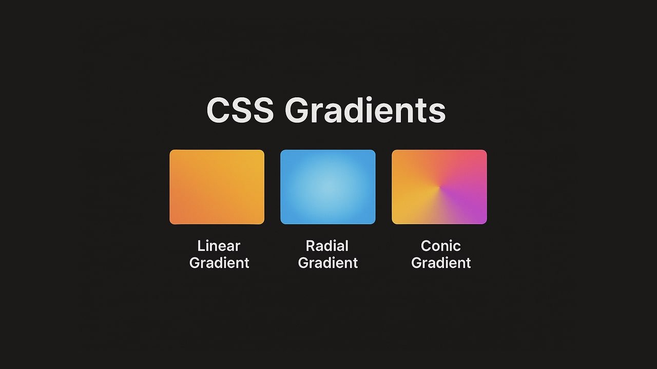
There are three main types of gradients in CSS:
- Linear Gradients – Color transition in a straight line.
- Radial Gradients – Color transition from a center point outward in a circle or ellipse.
- Conic Gradients – Color transition around a central point in an angular direction.
1. Linear Gradients
A linear gradient moves colors along a straight path (horizontal, vertical, or diagonal).
Syntax:
background: linear-gradient(direction, color1, color2, ...);Directions:
to right→ Left to rightto bottom→ Top to bottom32deg→ Custom angle
Example – Left to right Gradient:
background: linear-gradient(to right, #2c4aa1, #1df5fa);Example – Top to bottom Gradient:
background: linear-gradient(to bottom, #2c4aa1, #1df5fa);Example – Diagonal Multi-Color Gradient:
background: linear-gradient(32deg, #2c4aa1, #1df5fa);You can make a gradient diagonally by adding both the horizontal and vertical starting positions.
The following example shows a linear gradient which starts at top left and goes to bottom right. It starts purple, transitioning to green:
Using Multiple Color Stops
The following example shows a linear gradient (from top to bottom) with multiple colors:
background: linear-gradient(#2c4aa1, #1df5fa, #23b3d8);The following example shows Ranbow effects
background-image: linear-gradient(to right, #ff3911,#ff6c00,#fffb00,#10ff07,#0804ff,#08e9ff,#08e9ff);Using Transparency:
background-image: linear-gradient(to right, rgba(0,255,0,0), rgba(255,0,0,1));Repeating a linear-gradient:
The following repeating a linear-gradient shows repeating of linear fradient with three colors.
background-image: repeating-linear-gradient(#bbd632, #7ba528 10%, #aacc02 20%);2. Radial Gradients
A radial gradient starts from a center point and radiates outwards.
Syntax:
background: radial-gradient(shape size at position, color1, color2, ...);Shapes:
circle→ Perfect circleellipse→ Elliptical shape
Example – Circular Gradient:
background: radial-gradient(circle, #89f7fe, #89f7fe);Example – Elliptical Gradient:
background: radial-gradient(ellipse at center, #ffecd2, #fcb69f);By default, radial gradient shows ellipse. The following example showing wth multiple color
background-image: radial-gradient(#770a7f, #ecf709, #0c9f60, #0f0f54);Here are the some more radial shapes:
1. Code:
background: radial-gradient(#ff0342 5%, #f00342 15%, #f78402 60%);2. Code
background: radial-gradient(at center, #731DEB, #D73E42);3. Conic Gradients (CSS3)
A conic gradient rotates colors around a center point.
Syntax:
background: conic-gradient(from angle at position, color1, color2, ...);Example of using position bottom:
background: conic-gradient(from 315deg at bottom, #731DEB, #D73E42);4. Repeating Gradients
You can repeat patterns using:
repeating-linear-gradient()repeating-radial-gradient()repeating-conic-gradient()
Example – Striped Pattern:
5. Using Transparency in Gradients
Transparency is added using rgba() or hsla() colors.
Example – Overlay Gradient:
background: linear-gradient(rgba(0,0,0,0.5), rgba(0,0,0,0.1)), url('https://www.htmlpixel.com/wp-content/uploads/2025/08/CSS-Effects-min.jpg');6. CSS Gradient for Text
You can apply gradients to text using background-clip.
Example is give below:
background: linear-gradient(to right, #2c4aa1, #1df5fa);
  -webkit-background-clip: text;
-webkit-text-fill-color: transparent; font-size:100px; font-weight:bold; 7. CSS Gradient Borders
Following example showing gradient border to div block
8. CSS Gradient Buttons
The following example showing button gradient
background: linear-gradient(to right, #00f260, #0575e6);
  padding: 10px 20px;
  border: none;
  color: white;
cursor: pointer;9. Browser Support
Linear and Radial gradients supports all modern browsers
Conic gradients supported in most modern browsers (Chrome, Edge, Firefox, Safari)
some old browsers require -webkit- prefixes to run gradient properly on old browsers