If you’ve worked on even a few frontend projects, you already know this:
design-to-code is where most problems start.
On paper, converting a Figma design into HTML and CSS sounds simple. But in reality, this step decides whether a project feels smooth or turns into endless back-and-forth between designers, developers, and clients.
I’ve worked on many Figma to HTML/CSS projects—landing pages, SaaS websites, startup sites—and over time, certain practices consistently saved time, reduced revisions, and delivered better results.
This article shares those practical best practices, not theory.
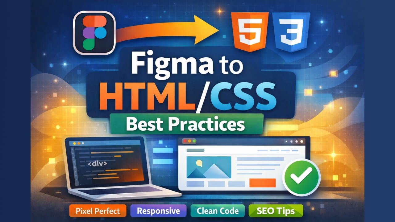
Why Figma to HTML/CSS Needs a Proper Approach
Figma is flexible. HTML and CSS are strict.
Designers think visually, while browsers think structurally. If you directly “copy” a design without understanding layout logic, you’ll end up with:
- Broken responsiveness
- Messy CSS
- Hard-to-maintain code
- Clients asking, “Why doesn’t it look the same?”
A good Figma-to-HTML process bridges that gap.
Start by Understanding the Design (Not Coding)
Before writing code, pause and study the Figma file.
Ask yourself:
- Is there a grid system?
- What spacing pattern is used (8px, 16px)?
- Are fonts reused consistently?
- Are components repeated?
Many beginners jump straight into HTML. That’s the fastest way to create problems later.
📌 Rule I follow:
If the design isn’t clear, the code won’t be either.
Don’t Convert Frames Literally
Figma frames are not HTML elements.
One common mistake is trying to recreate every Figma frame with a <div>. That leads to unnecessary nesting and bloated markup.
Instead:
- Understand why a frame exists
- Decide whether it should be a
section,article, ordiv - Group content logically, not visually
HTML should describe structure, not layout.
Use Semantic HTML (Your Future Self Will Thank You)
Semantic HTML is not optional—it’s a habit.
Use:
<header>for top sections<nav>for navigation<main>for main content<section>for content blocks<footer>for footers
This helps with:
- SEO
- Accessibility
- Readability
- Maintenance
Clients don’t see this, but Google and screen readers do.
Layout: Flexbox and Grid Are Enough
If you’re still using floats or complex hacks, stop.
Use Flexbox for:
- Navigation bars
- Buttons
- Aligning items
- Simple rows or columns
Use CSS Grid for:
- Page layouts
- Card sections
- Complex responsive areas
You don’t need both everywhere. Pick the right tool for the job.
Pixel-Perfect Doesn’t Mean Pixel-Rigid
Clients often ask for “pixel-perfect” design.
What they actually want is visual accuracy, not exact pixel values.
Good practices:
- Use
reminstead of hard-codedpx - Let content breathe
- Match spacing visually, not mathematically
- Respect font line-height and spacing
Real websites need flexibility.
Mobile-First Makes Everything Easier
If the Figma file includes mobile designs (it should), always:
- Start with mobile CSS
- Scale up for tablet and desktop
This avoids:
- Overwritten styles
- Messy media queries
- Broken layouts
Mobile-first CSS is simpler, cleaner, and more future-proof.
Keep CSS Clean and Predictable
Messy CSS is one of the biggest problems in Figma-to-HTML projects.
Avoid:
- Random class names
- Inline styles
- Repeating the same values everywhere
Instead:
- Use clear, meaningful class names
- Group related styles
- Reuse components
- Remove unused CSS
Readable CSS is professional CSS.
Components Are Your Best Friend
If a button appears 10 times in the design, it should be one component, not 10 different styles.
Create reusable styles for:
- Buttons
- Cards
- Headings
- Forms
- Badges
This makes future changes easy and keeps the design consistent.
Fonts and Icons: Less Is More
Fonts
- Match font weight and line height carefully
- Avoid too many font variants
- Use Google Fonts or self-hosted fonts properly
Icons
- Prefer SVG over PNG
- Keep icon sizes consistent
- Avoid mixing different icon styles
These small details make a big difference in final output.
Responsiveness Is Not Optional
A desktop-only design is incomplete.
Test your HTML/CSS on:
- Mobile
- Tablet
- Large screens
Watch for:
- Overflow issues
- Broken spacing
- Text wrapping problems
A responsive site feels professional. A non-responsive one feels unfinished.
Accessibility Is Part of Quality
Accessibility is often ignored—but it shouldn’t be.
Simple things you can do:
- Use proper heading order
- Add
alttext to images - Ensure color contrast
- Make buttons clickable via keyboard
You don’t need to be an expert—just be mindful.
Performance Matters More Than You Think
A visually perfect site that loads slowly is a bad site.
Basic performance tips:
- Optimize images
- Avoid heavy animations
- Keep CSS lightweight
- Remove unused styles
Clean HTML and CSS load faster by default.
SEO Starts with HTML Structure
SEO is not only about content—it’s also about structure.
Make sure:
- There is one
<h1>per page - Headings follow hierarchy
- Sections are meaningful
- Markup is clean
Good structure helps search engines understand your page.
Framework or Pure CSS? Decide Early
Some clients want:
- Tailwind CSS
- Bootstrap
- Or pure custom CSS
There’s no “best” choice—only the right choice for the project.
Confirm this early to avoid rewrites later.
Final Review Before Delivery
Before submitting:
- Compare with the Figma design
- Test responsiveness
- Check spacing and fonts
- Validate HTML/CSS
- Fix small UI gaps
This final step separates average developers from good ones.