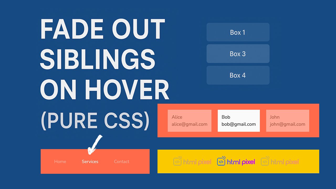
Modern CSS Fade-Out-Siblings Technique Explained for Beginners
Hover-based interactions are widely used in modern UI design to make interfaces smoother, cleaner, and more interactive. One popular effect is “fade out siblings on hover,” meaning when you hover over one element, all other elements become slightly transparent. This naturally draws attention to the hovered item.
This technique improves user experience, focus, and content readability, especially in galleries, menus, feature cards, and product lists.
With pure CSS you can achieve this effect using:
:hover:not():has()(modern browsers)transition- opacity changes
Let’s start with the core concept.
<div class="block">
  <div class="block-item">Item 1</div>
  <div class="block-item">Item 2</div>
  <div class="block-item">Item 3</div>
</div>
.block{
background-color:#178dde;
padding:30px 12px;
}
.block-item {
transition: opacity 0.3s;
}
/* Using :hover + :not() */
.block:hover .block-item:not(:hover) {
opacity: 0.5;
}
/* Using :has() (modern CSS) */
.block:has(.block-item:hover) .block-item:not(:hover) {
opacity: 0.5;
}Above code explanation
.block-item { transition: opacity 0.3s; }
- Adds smooth animation for opacity changes.
- Without this, fading would be instant, not smooth.
0.3smeans the fade effect takes 0.3 seconds.
.block:hover .block-item:not(:hover)
block:hover→ effect starts only when the mouse enters the container..element:not(:hover)→ selects all elements except the hovered one.opacity: 0.5;→ dims all non-hovered elements to 50%.
This creates the classic “focus on one item” fade effect.
:has() version
:has(.block-item:hover)→ block detects if any child element is being hovered.- More precise + better readability.
- Supported in modern browsers (Chrome, Edge, Safari).
Live Demo
Now let me create further 10+ demo example so it will be more clear. Don’t forget to make practice on your system. Copy/paste code and create file as index.html and paste code in file index.html and open with any browser to see demo.
Example : Basic Card List Fade
Copy/paste below code to check on your pc
<style>
.fade-basic{
background-color:#f07453;
}
.fade-basic .element {
  padding: 20px;
  background: #eee;
  margin: 10px;
  transition: opacity 0.3s;
}

.fade-basic:has(.element:hover) .element:not(:hover) {
  opacity: 0.4;
}

</style>

<div class="fade-basic">
  <div class="element">Card A</div>
  <div class="element">Card B</div>
  <div class="element">Card C</div>
</div>
Demo:
Example : Image Gallery Hover Fade
<style>
  .gallery {
    padding: 30px 20px;
    background: #f2ca00;
    display: flex;
    flex-wrap: wrap;
    justify-content: center;
    gap: 24px;
  }

  .gallery img {
    width: 150px;
    transition: opacity 0.3s;
  }

  .gallery:hover img:not(:hover) {
    opacity: 0.3;
  }
</style>

<div class="container gallery">
  <img class="element" src="https://www.htmlpixel.com/wp-content/uploads/2025/09/cropped-cropped-htmlpixel-1.png">
  <img class="element" src="https://www.htmlpixel.com/wp-content/uploads/2025/09/cropped-cropped-htmlpixel-1.png">
  <img class="element" src="https://www.htmlpixel.com/wp-content/uploads/2025/09/cropped-cropped-htmlpixel-1.png">
</div>
Demo:
Example : Navigation Menu Fade Out
<style>
  .navContainer {
    padding: 30px 20px;
    background: #f17454;
    display: flex;
    flex-wrap: wrap;
    justify-content: center;
    gap: 24px;
  }
  .navContainer-item{
    color: #fff;
    cursor: pointer;
  }

  .navContainer .navContainer-item {
    display: inline-block;
    padding: 12px 20px;
    transition: opacity 0.3s;
  }

  .navContainer:hover .navContainer-item:not(:hover) {
    opacity: 0.4;
  }

</style>

<ul class="navContainer">
  <li class="navContainer-item">Home</li>
  <li class="navContainer-item">Services</li>
  <li class="navContainer-item">Contact</li>
</ul>
Demo:
Example : Product Feature Blocks
<style>
  .featuresBlock {
    padding: 30px 20px;
    background: #f17454;
    display: flex;
    flex-wrap: wrap;
    justify-content: center;
    gap: 24px;
  }
  .featuresBlock .featuresBlock-item {
  background: #f9f9f9;
  border: 1px solid #ddd;
  padding: 25px;
  transition: opacity 0.3s;
}

.featuresBlock:hover .featuresBlock-item:not(:hover) {
  opacity: 0.5;
}
</style>

<div class="featuresBlock">
  <div class="featuresBlock-item">Speed</div>
  <div class="featuresBlock-item">Security</div>
  <div class="featuresBlock-item">Support</div>
</div>
Demo:
Example : Pricing Table Fade
<style>
  .pricingBlock {
    padding: 30px 20px;
    background: #ef7453;
    display: flex;
    justify-content: center;
    gap: 24px;
    flex-wrap: wrap;
  }

  .pricingBlock .pricingBlock-element {
    padding: 30px;
    background: white;
    border: 1px solid #ddd;
    transition: opacity 0.3s;
  }

  .pricingBlock:has(.pricingBlock-element:hover) .pricingBlock-element:not(:hover) {
    opacity: 0.4;
  }
</style>

<div class="pricingBlock">
  <div class="pricingBlock-element">Basic</div>
  <div class="pricingBlock-element">Pro</div>
  <div class="pricingBlock-element">Enterprise</div>
</div>
Demo:
Example : Blog List Hover Focus
<style>
  .blogListArea {
    padding: 30px 20px;
    background: #f17454;
    display: flex;
    justify-content: center;
    gap: 24px;
    flex-wrap: wrap;
  }

  .blogListArea .blogListArea-element {
    padding: 20px;
    border-bottom: 1px solid #ddd;
    transition: opacity 0.3s;
  }

  .blogListArea:hover .blogListArea-element:not(:hover) {
    opacity: 0.5;
  }
</style>

<div class="blogListArea">
  <article class="blogListArea-element">Blog 1</article>
  <article class="blogListArea-element">Blog 2</article>
  <article class="blogListArea-element">Blog 3</article>
</div>
Demo:
Example : Team Members Fade Out
<style>
  .teamArea {
    padding: 30px 20px;
    background: #f17454;
    display: flex;
    justify-content: center;
    gap: 24px;
    flex-wrap: wrap;
  }

  .teamArea .teamArea-element {
    padding: 15px;
    background: #fafafa;
    transition: opacity 0.3s;
  }

  .teamArea:hover .teamArea-element:not(:hover) {
    opacity: 0.4;
  }
</style>

<div class="teamArea">
  <div class="teamArea-element">
    <div>Alice</div>
    <div>alice@gmail.com</div>
  </div>
  <div class="teamArea-element">
    <div>Bob</div>
    <div>bob@gmail.com</div>
  </div>
  <div class="teamArea-element">
    <div>John</div>
    <div>john@gmail.com</div>
  </div>
</div>
Demo:
Example: Category Filters with Fade
<style>
  .filtersArea {
    padding: 30px 20px;
    background: #f17454;
    display: flex;
    justify-content: center;
    gap: 24px;
    flex-wrap: wrap;
  }

  .filtersArea .filtersArea-element {
  padding: 10px 20px;
  transition: opacity 0.3s;
}

.filtersArea:hover .filtersArea-element:not(:hover) {
  opacity: 0.5;
}

</style>

<div class="filtersArea">
  <button class="filtersArea-element">All</button>
  <button class="filtersArea-element">Web</button>
  <button class="filtersArea-element">App</button>
  <button class="filtersArea-element">UI</button>
  <button class="filtersArea-element">UX</button>
</div>
Demo:
Example : Social Icons Fade Effect
<style>
  .socialArea {
    padding: 30px 20px;
    background: #f17454;
    display: flex;
    justify-content: center;
    gap: 24px;
    flex-wrap: wrap;
  }

  .socialArea .socialArea-element {
    font-size: 10px;
    padding: 10px;
    transition: opacity 0.3s;
  }

  .socialArea:hover .socialArea-element:not(:hover) {
    opacity: 0.3;
  }
</style>

<div class="socialArea">
  <div class="socialArea-element">
    <svg fill="#000000" height="40px" width="40px" version="1.1" id="Layer_1" xmlns="http://www.w3.org/2000/svg"
      xmlns:xlink="http://www.w3.org/1999/xlink" viewBox="-337 273 123.5 256" xml:space="preserve">
      <path d="M-260.9,327.8c0-10.3,9.2-14,19.5-14c10.3,0,21.3,3.2,21.3,3.2l6.6-39.2c0,0-14-4.8-47.4-4.8c-20.5,0-32.4,7.8-41.1,19.3
	c-8.2,10.9-8.5,28.4-8.5,39.7v25.7H-337V396h26.5v133h49.6V396h39.3l2.9-38.3h-42.2V327.8z" />
    </svg>
  </div>
  <div class="socialArea-element">
    <svg fill="#000000" height="40px" width="40px" version="1.1" id="Layer_1" xmlns="http://www.w3.org/2000/svg"
      xmlns:xlink="http://www.w3.org/1999/xlink" viewBox="-271 273 256 256" xml:space="preserve">
      <path d="M-64.5,273h-157c-27.3,0-49.5,22.2-49.5,49.5v52.3v104.8c0,27.3,22.2,49.5,49.5,49.5h157c27.3,0,49.5-22.2,49.5-49.5V374.7
	v-52.3C-15.1,295.2-37.3,273-64.5,273z M-50.3,302.5h5.7v5.6v37.8l-43.3,0.1l-0.1-43.4L-50.3,302.5z M-179.6,374.7
	c8.2-11.3,21.5-18.8,36.5-18.8s28.3,7.4,36.5,18.8c5.4,7.4,8.5,16.5,8.5,26.3c0,24.8-20.2,45.1-45.1,45.1s-44.9-20.3-44.9-45.1
	C-188.1,391.2-184.9,382.1-179.6,374.7z M-40,479.5C-40,493-51,504-64.5,504h-157c-13.5,0-24.5-11-24.5-24.5V374.7h38.2
	c-3.3,8.1-5.2,17-5.2,26.3c0,38.6,31.4,70,70,70c38.6,0,70-31.4,70-70c0-9.3-1.9-18.2-5.2-26.3H-40V479.5z" />
    </svg>
  </div>
  <div class="socialArea-element">
    <svg fill="#000000" height="40px" width="40px" version="1.1" id="Layer_1" xmlns="http://www.w3.org/2000/svg"
      xmlns:xlink="http://www.w3.org/1999/xlink" viewBox="-337 273 123.5 256" xml:space="preserve">
      <path d="M-260.9,327.8c0-10.3,9.2-14,19.5-14c10.3,0,21.3,3.2,21.3,3.2l6.6-39.2c0,0-14-4.8-47.4-4.8c-20.5,0-32.4,7.8-41.1,19.3
	c-8.2,10.9-8.5,28.4-8.5,39.7v25.7H-337V396h26.5v133h49.6V396h39.3l2.9-38.3h-42.2V327.8z" />
    </svg>
  </div>
</div>
Demo: