Struggling to center elements in CSS? Learn how to center text, divs, images, and more using Flexbox, Grid, and traditional CSS methods. Step-by-step guide for beginners with examples.
Table of Contents
- Why Centering in CSS Can Be Tricky
- Method 1: Centering with Flexbox
- Method 2: Centering with CSS Grid
- Method 3: Centering Using Text Align
- Method 4: Center with Margin Auto
- Centering an Image in CSS
- Bonus: Center with Position and Transform
- Common Mistakes to Avoid
- Final Thoughts
Why Centering in CSS Can Be Tricky
Many beginners struggle with centering elements in CSS because there isn’t just one universal method. Whether you’re centering text, a div, or an image, the approach may vary depending on the layout method—Flexbox, Grid, or even classic positioning.
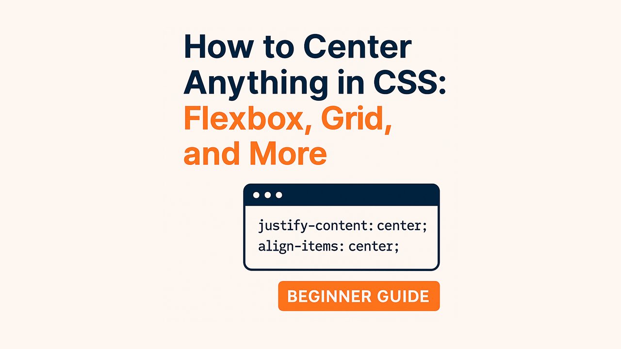
Method 1: Centering with Flexbox
Flexbox is the most popular and modern method to center both vertically and horizontally.
Example: Center a div horizontally and vertically
<div class="flex-center">
  <p>Hello World!</p>
</div>
.flex-center {
  display: flex;
  justify-content: center; /* horizontal */
  align-items: center;     /* vertical */
  height: 200px;
  background-color: #f3f3f3;
}
Why it works:
Flexbox aligns content along both axes with justify-content and align-items.
Method 2: Centering with CSS Grid
CSS Grid is powerful for layout and makes centering even simpler.
<div class="grid-center">
  <p>I’m centered with Grid!</p>
</div>
.grid-center {
  display: grid;
  place-items: center;  /* shorthand for both horizontal & vertical centering */
  height: 200px;
  background: #e0f7fa;
}
Why it works:place-items: center centers child elements both ways.
Method 3: Centering Using Text Align
Use this method for inline elements like text or inline images.
<div class="text-center">
  <span>Centered Text</span>
</div>
.text-center {
  text-align: center;
}
Note: Only works for inline or inline-block elements (like <span>, <img>).
Method 4: Center with Margin Auto
This is a classic method for horizontally centering block-level elements.
<div class="margin-auto">Centered Box</div>.margin-auto {
width: 200px;
margin: 0 auto;
background: #ffd54f;
}Only horizontal centering. Doesn’t work for vertical centering.
Centering an Image in CSS
Method 1: Using text-align
<div class="image-wrapper">
  <img src="image.jpg" alt="Sample Image" />
</div>
.image-wrapper {
text-align: center;
}Method 2: Display block + margin auto
img {
  display: block;
  margin: 0 auto;
}
Bonus: Center with Position and Transform
For absolute centering, use this method:
<div class="absolute-center">Centered!</div>
.absolute-center {
  position: absolute;
  top: 50%;
  left: 50%;
  transform: translate(-50%, -50%);
}
Works great when you know the element’s size or want to overlay content.
Common Mistakes to Avoid
- Forgetting
heightwhen using vertical alignment. - Using
text-align: centeron block elements (it doesn’t work). - Mixing
floatwith modern layout methods like Flexbox/Grid. - Not setting
display: flexordisplay: grid.
Centering elements in CSS doesn’t have to be hard once you know the right tool for the job:
| Use case | Best Method |
|---|---|
| Center block horizontally | margin: 0 auto |
| Center text | text-align: center |
| Center vertically & horizontally | Flexbox or Grid |
| Absolute center | position + transform |
Whether you’re building a landing page, form layout, or image gallery, mastering centering is a must-have CSS skill. Try out each method and see what works best for your layout needs.